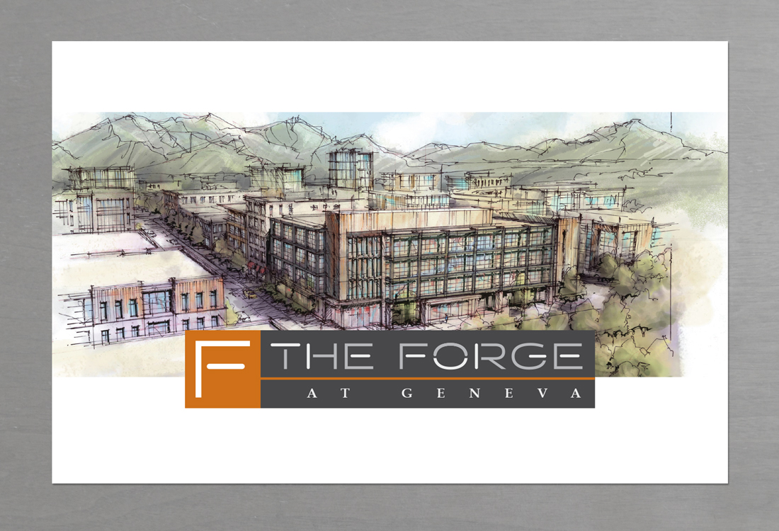
The Forge at Geneva
Brand Identity coordination with Architectural Rendering
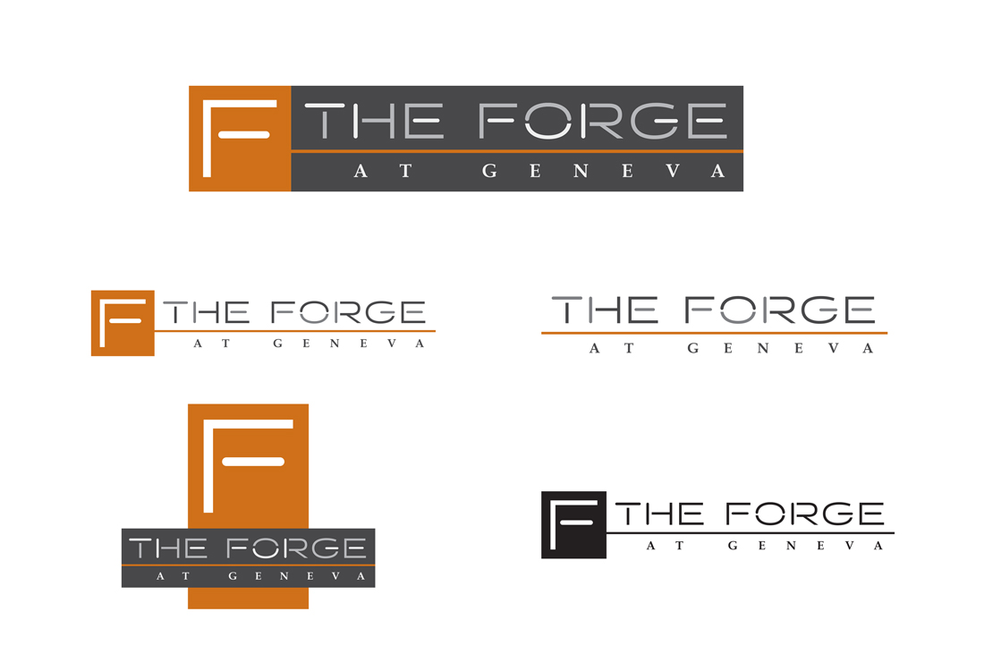
Brand Identity and wordmark variations
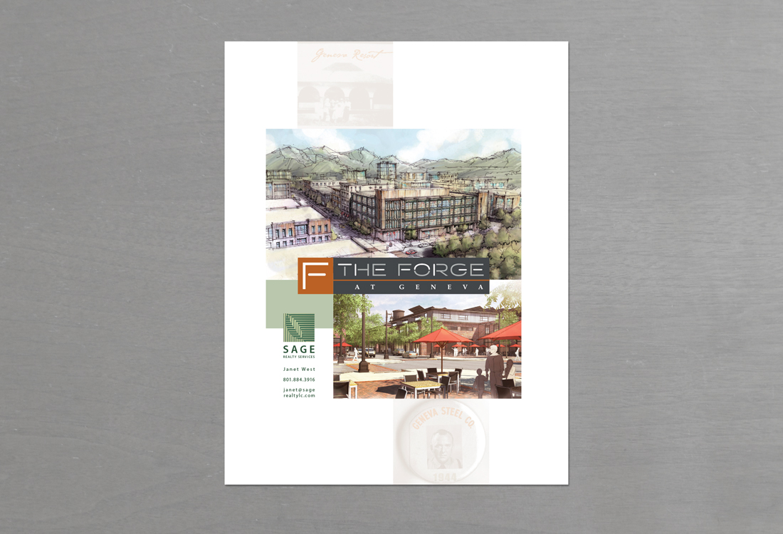
Front of Promotional Flyer
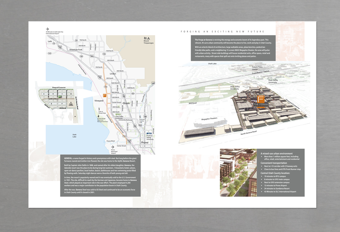
Inside Spread of Promotional Flyer
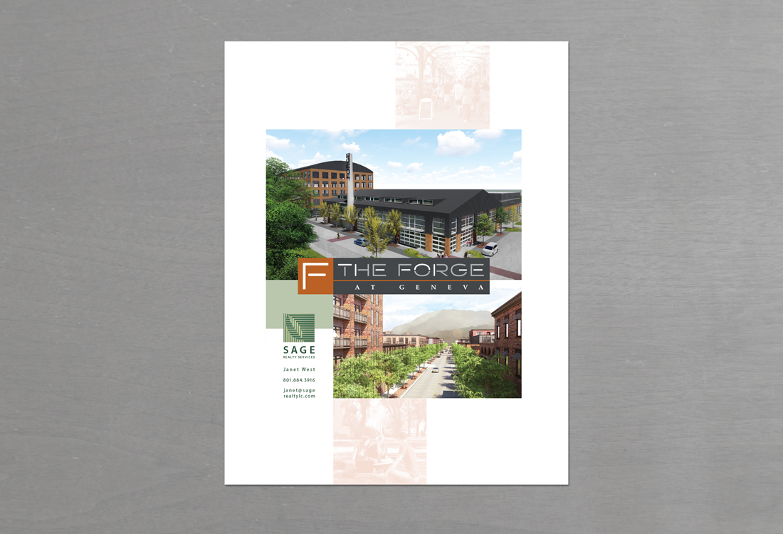
Back of Promotional Flyer
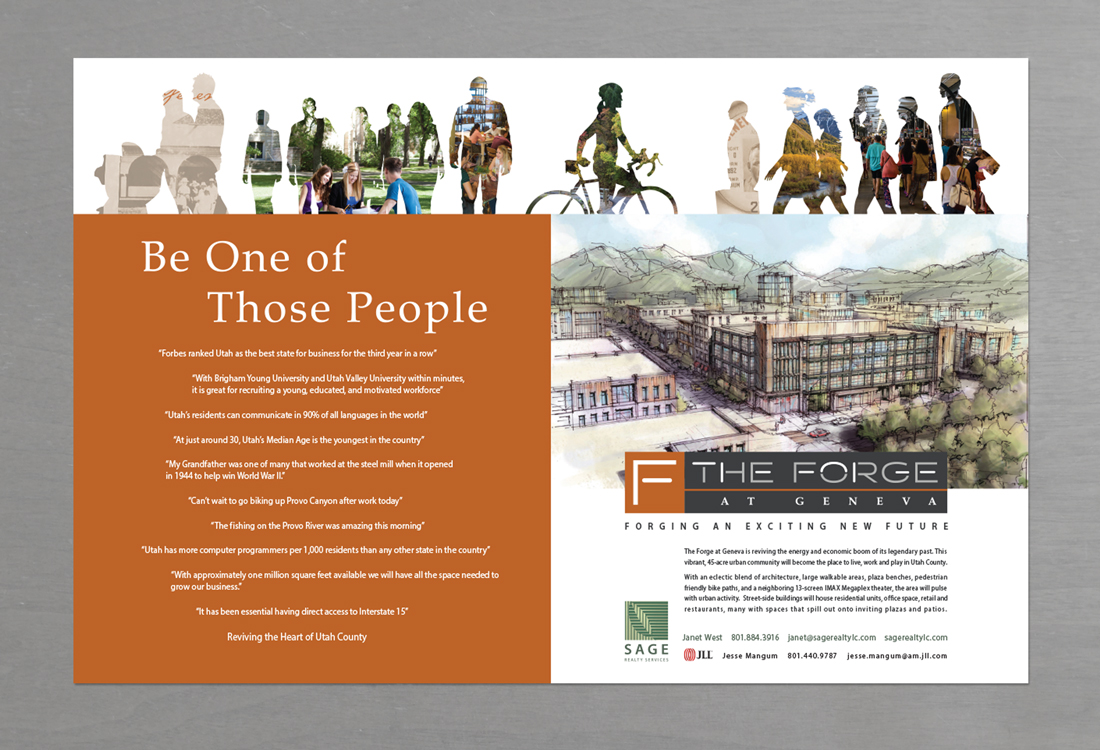
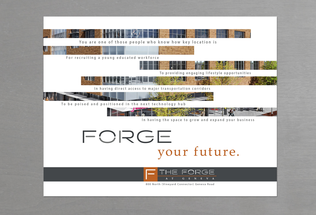
Double Page Ad for Life in Utah Magazine
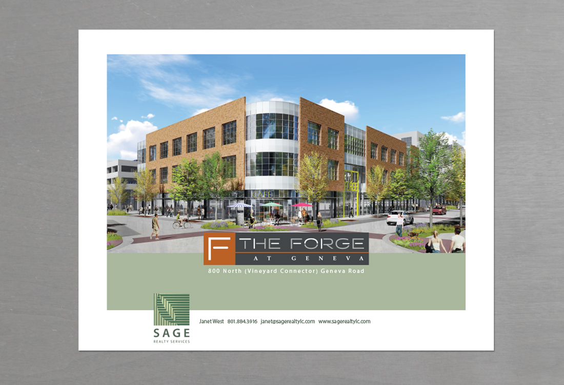
Single Sided flyer for Sage Realty's use on their Website
Promotional Single Sided Flyer
About This Project
The Forge at Geneva is a large scale urban mixed-use project under development by Dakota Pacific in Utah County. Stippich Design was brought onto the project by Janet West of Sage Realty Services. Our collaboration began with the development of a brand identity and initial promotional flyer for The Forge at Geneva.
The process began by researching the history of Geneva. We at Stippich Design were familiar with Geneva Steel which had been an economic force in Utah County for the second half of the 20th century. During our research we became aware of a historical marker dedicated to honoring a historic lakeside resort that had been located on the spot and named Geneva after the owners oldest daughter. We presented this historical information to the developer and Janet West as a basis for begin developing a brand story of how this new development is located on what had been an economically important location for a long time and now through the clean up of the site and development of this new project were reinstating the location to it’s historic place as an economic driver to the region anew.
To develop the final aesthetic look of the brand identity we presented a range of concepts from designs that included a recreation of a handwritten “Geneva” taken from the historical marker plaque to more modern concepts that highlighted Geneva’s time as a successful steel mill during and after World War II. Through the process of collaboration and discussing these concepts with the developer and Sage Realty and looking at proposed architectural renderings. It was decided to make the focus of the brand identity to be about the future and then incorporate the historical elements of the brand story into the promotional flyer. During this process Janet West presented a typeface that she responded to positively as holding the modern aesthetic that was being developed in the architecture of the project. Our design team further deconstructed the typeface presented and rounded the edges to several elements to further emphasize the mixed use aspect of the project. We lightened these elements to represent several ideas, a pulse moving through a circuit board, reflective light on metal to bring in the site’s history as a steel mill and an overall energy of movement and activity the developer wants to bring to the project. The color palette of various shades of grays and orange of the brand identity was to draw from it’s history of it being a steel mill with a forge and that process of creation.
Having developed the brand identity and the core elements of the brand story the collaboration moved to creating a promotional flyer for the project. Telling the brand story of the historical significance of the Geneva name to the region and how The Forge will be building on that rich legacy to create a new development for people to live, work and meet for leisure activities. This was not only done through the development of the messaging but also graphically by using screen backed historic images from the periods Geneva was a lakeside resort and it’s days as a steel mill. Once the flyer’s messaging moves to the size, vision and features of The Forge the screened back images have a more orangish hue and are centered on lifestyle images of the activities and energy the developers have planned for The Forge. Stippich Design also created a custom map to display The Forge’s location as well as nearby entities that make The Forge’s location so unique. Stippich Design and Sage Realty also collaborated together on design of a double page ad for The Forge at Geneva for Life in Utah Magazine and individual flyer pages that Sage Realty could update amenities and features of The Forge to place on their website and hand out at meetings.
Owner
Client
Date
2013 - 2018
